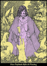
Here’s a first installment in a series of critiques of the (mostly) pen & ink techniques of the late Moebius (Jean Giraud). I plan to intersperse them with my Snark GN postings, so don't freak out, fellow Carrollians.
For now I’ll focus on his Airtight Garage, a scorched-earth masterpiece in which he rang through almost all the changes of pen and brush, a bravura performance which utterly blew this inkster’s mind when he first saw it in Heavy Metal in the 70s. We could sum up The Airtight Garage as a comix version of the Goldberg Variations, a series of constrained deviations to delight both connoisseur and professional.
Good inking is a performance, frozen in time by the medium of mass-reproduction, and like all performances, it follows rules, overt or otherwise. The Airtight Garage has 3 basic rules:
1. Only two colors will be used: black and white. (1)
2. All artwork will be camera-ready, ie., cleanly inked with no excessive wasted work when reduced (dropped-out or filled-in line-work), no shadows, sloppy pro-whiting, left-over penciling, etc.
3. The final results will be attractive to the viewer.
The last rule is crucial, it is the Prime Directive of the commercial illustrator. In fact, all 3 of these rules are commercial in nature but that’s beside the point for now. What matters is what Moebius added to these rules, employing different constraints upon different pages with results reminiscent of the salad days of Oulipo.
Let’s start with a great page from the AG: number 36. What are the rules of this page?
4. no brush work, only pen and furthermore, at least one pen was a nicely flexible nib (using different nibs on the same page is a double-plus-good inking practice … although using only one nib can also serve as a good constraint).
5. minimal crosshatching, almost entirely hatching
6. a high-keyed lighting scheme, ie., inking mostly in the 0-40% zone of the greyscale, with only a minimum of shadows and spotting. This tonal scheme is one of the hallmarks of The Airtight Garage; Moebius loved the contrast of delicate tonalities spotted with a few judicious dark passages and it gave his inking a solarized feel, an American southwest desert lighting scheme which contrasts deliciously with the French sensibilities of the (minimal) plot. We should also note that, all theorizing aside, high-key inking is often faster to execute.
The first tier sets the tone of the page. The loose hatching on the backs of both the man and the woman semi-serves as a contour function, roughly indicating volume. There's a minimal crosshatching, normal to the long lines and probably done wet on wet. The man’s hatching lines are drifting too far apart to integrate with the white. They are functioning on their own, tending more towards pattern/calligraphy instead of tone/local texture.
There is a ratio between the thickness of an inked line and the thickness of the adjacent white line (2) that when done properly creates an effect I call “petillance”, a sort of optical sparkle similar to the chromatic analogue of simultaneous contrast. The effect works with both hatching & crosshatching but because Moebius kept the AG mostly high-keyed, we see little of it. Petillance works with any line width but rarely below a 40% over-all tone. The amount of reduction also effects it and that should be taken into account when using it.
The Beardsley drawing shown here is a classic example of petillance (a bit dark though, which is not a requisite of the technique) and Beardsley would have been aware of it thanks to the commercial wood-engraving techniques that had become obsolete in his own lifetime.
In page 36 of The Airtight Garage, the girl’s hair in tiers 1 and 2 has nice passages of petillance in them, which is why they look so satisfyingly rich and crisp to the eye. In addition, unlike the man's back, the girl's hatching in tier one is mostly petillant, owing to the tighter spacing in proportion to line width (or vice versa, the white lines are sized in a better proportion to the black lines).
The backs of the figures in tier 1 have locked in the general inking feel of the page. Moebius had a penchant for letting his lines shed their tonal and volumetric function and work in a more calligraphic, patterned manner, weaving them in and out of more tonal hatching/crosshatching. This calligraphic business creates a powerful rhythm on the page and it requires a flexible nib, really good hot-plate paper and most of all, a steady, confident hand moving quickly.
In fact, one could classify all pen work by the velocity of the hand moving the nib. Faster means more swell and taper, more energy and also, more reliance on draftsmanship. Slow is the speed of a more classical and conservative crosshatcher who focuses on rendering volume, shade and texture and eschews the bravura of calligraphy.
Which leads us to the starting rule of this particular page, or at least of the first two tiers:
7. Make lots of optically long lines.
There’s a bit of dashing and dotting here and there and a soupçon of crosshatching but on the whole, the lines in the first two tiers are long and draw attention to themselves, especially by avoiding petillance. Long lines require either slowing down to make them seamless, or, as Moebius loved to do, butting medium long, mono-width, unswelled lines end to end. The hatching in the very first panel shows this butting nicely. It avoids using crosshatching to create the darks and goes straight into a solid spotting. This butting together of shorter lines was a basic move of Moebius’ crosshatching (and most French crosshatching of the time) and when done as crosshatching, it means simultaneously advancing & rotating nib and hand in an orbit around the axis of the implicit spherical volume.
The hair passages in tiers 1 and 2 are not only petillant but also governed by lines of beauty. Note that in the uppermost left-hand corner of the 2nd tier, the man's hair drifts so far apart that the lines tend to cease cooperating with the white, although their natural tendency to revert to purely calligraphic lines is subverted by a loss of curve and swell (3) in certain spots. The lagging of this passage is confirmed by the slight shakiness of the lines; my suspicion is that Moebius was going too fast to bother with turning the page to a more comfortable angle.
NB. On the other hand, just to show how attention to detail pays off, Moebius takes care to make the borders of the whole page petillant, using the classic scotch rule so beloved by those wood-engraving petillistes of yore.
The shorter line-work of the rendering of faces and wall in tier 2 makes a good optical foil for the superb calligraphic passage of the three guards standing in the door. When doing linear rendering at a smaller scale, judicious omission is critical — one is creating a pattern, not tonal volumes — and Moebius flavors the contour lines with delicate flecking and dotting which he also deploys in the girl’s face. Note that most of the minimal marks of her face still cling to the invisible grid of the contour lines governing an implicit and undrawn crosshatching.
Then he moves down and lets the girl’s neck go calligraphic, along with the back of her seat and her shoulders. This panel is quite beautiful, the mixing of techniques creates an infinite depth of field, in other words, Moebius avoids the traditional use of a focal design point and lets everything in the panel come forward all at once. The effect is dreamlike and precise at once.
Tiers 1 and 2 are inked in a somewhat different style than the bottom of the page; down here Moebius speeds up his hand. The lines get shorter and the remaining long lines are really the contour lines, which are far more jumpy than before. One might say that the bottom of the page has jettisoned the long-line rule, in which case, we’ll decide to amend our last rule to:
8a. Speed up on the last tier’s inking.
The bottom of the page is executed faster and reads faster, more energetic and jumpier. The final panel has some very long contour lines (almost naked in their avoidance of thick-thin calligraphy and relying entirely on the skillful negative spacing of good draftsmanship to succeed) but most of the linework is fast and “stabby” with the nib. Note how the spotting of black shadows in the first panel of tier 3 is so nervous that the white flecks go petillante, which gives the lighting scheme that classic Moebius solarized desert feeling — even indoors!
The reason for this change of rule? Who knows … pressing deadlines? Some unexpected Lebanese Sunshine? A hot date for the night? I think we have here another axiom of our art-as-performance-game, an axiom which eludes some critics:
9. Be prepared to go aleatory. Stuff happens, finish the page no matter what.
Perhaps Moebius sped up on purpose or perhaps he just got distracted by something, we’ll never know. In any case, we clearly see his hand speeding up but still remaining accurate.
One of the paramount qualities of Moebius’ inking style was the dominance of the hand. His physical pleasure in drawing shaped every line, every panel and every page. He reminds me very much of Velasquez or Rubens at their best (which was superhuman), where the brush movements revealed their total immersion — and joy — in the visual story. (4)
The long line rule is a basic move in inking and Moebius tended towards it more and more in his career until he entered a genuine clear-line phase for several years. It should be pointed out that his draftsmanship was so good that this was an inevitable development. Technique is mastered to be thrown away at some point and I think he felt that clear-line would satisfy this zen-like rule. Alas, not only was the garage airtight but his draftsmanship seems to have been so innate that he could not throw it away. (5)
More to the point for us lesser inking mortals is that fact that the long line rule is essentially a calligraphic move. At the foot of the page Moebius slips into a faster mixed tonal-calligraphic mode with a nervous, shorter line, but the calligraphic still dominates. As a French inker, Moebius was well aware of the classical line tradition and for the French (as opposed to the German/Dutch tradition) it really begins with the calligraphic, not the volumetric attitude.
To round things off, let’s have a sample of hatching with a long-line and without significant petillance from Albrecht Dürer, the Renaissance master who perfected and standardized the two poles of line-work: the fast-calligraphic-hatching pole and the slow-tonal-crosshatching pole. Quite an accomplishment and more to the point, both styles still attract the jaded 21st-century eye (see Rule #3) and reproduce well (Rule #2) at a minimal cost (Rule #1) when done properly.
We are all Dürer’s children, even Moebius. Different technologies allowed the latter to greatly expand the rules of the inking performance-game but both men relied on this final, most important inker's axiom:
10. Draw, don’t just ink. And remember that you’re drawing with white.
(1) Moebius used zipatone on a few pages but technically, it’s still black. Anyone who’s ever shot photostats or film negs will confirm this to any readers who want to quibble over this point. Stipplers may want to weigh in also, if there's any of them left.
(2) The white of the page is not an empty space; it’s the equivalent of the black ink. Never forget that you are drawing with white at the same time as you’re drawing with black, and oftentimes you’ll ink better in tricky passages if you keep your eye focused on the white — not on the black — as you ink.
(3) That is, swelling the line-work not by pushing on the nib but by drawing another line very close to it, often merging into it and sharing its curve.
(4) By visual story I don't mean the conceptual ideas and symbols, but the purely nonverbal meaning generated by the visual structure and components of a picture: its 2D vocabulary, grammar and syntax. This is the quality which delights what was once called a “good eye” in the business and it is the heart of good draftsmanship — not mindless realism or slick technique.
(5) Was this because his draftsmanship and personality were the same? A fruitful subject for the introspective pen-ster with a taste for existential inkery. The very word draftsmanship is so misunderstood these days, it seems to be mistaken for having a camera-eye or something similarly dullard. Draftsmanship is a translation of reality into movements of the hand which speak pictures in the eye's native language — not the language of words or dull habit or style.
___________
NB. If you're interested in the late 70s/early 80s comix & SF scene in North America, including the French Wave of Heavy Metal, there's a very fine blog here … Nicollet, Loustal, Caza, Moebius, plus the great Paul Kirchner, Chaykin, lots of journeyman SF cover art … I'm keeping my fingers crossed for some Nicole Claveloux and a bit of B&W Bilal


